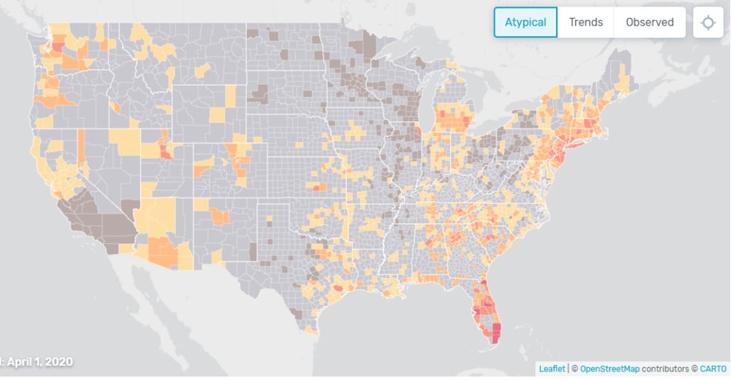
US health weathermap
“The map shows you how much influenza-like illness above the normal expected levels we have detected since March 1.
The time series chart allows you to compare Kinsa’s observations of the influenza-like illness level in the U.S., in orange and red, against where we’d expect them to be, in blue, and see how that relationship has changed over the past few weeks.”